
Inconsistent Color on Refresh Button in Unconnected Chains Page of DID Wallet

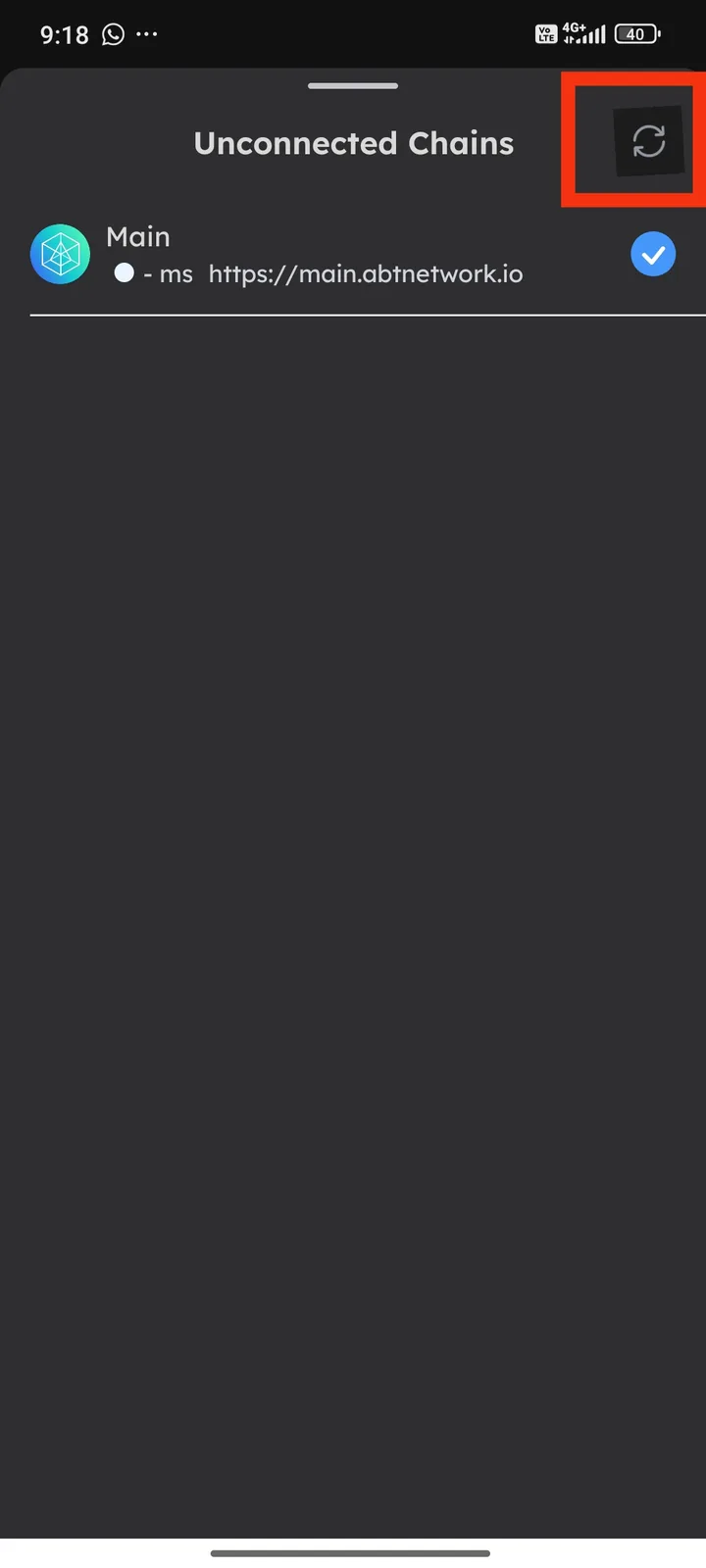
While using the DID Wallet application and navigating to the Unconnected Chains page, I noticed a design inconsistency with the refresh button located in the top-right corner. The icon appears with a noticeably darker color tone compared to other interface elements, making it look out of place and visually inconsistent with the overall design of the app.
This inconsistency may give users the impression that the button is disabled or inactive, even though it remains functional. Such design irregularities can lead to user confusion, reduce visual clarity, and impact the overall user experience. In an application like DID Wallet, where a clean and consistent interface is crucial, maintaining visual harmony is especially important.
It would be preferable if the refresh button on the Unconnected Chains page followed the same color scheme as other UI elements to ensure a consistent, intuitive, and professional user experience.
1 条回复
It looks normal on our test machine. This icon is also a background-transparent icon. It looks like your system changed its background.