Header Title Too Close to Search Icon on Mobile

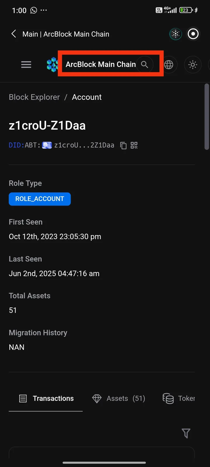
I noticed that the header title "ArcBlock Main Chain" is placed too close to the search icon on mobile. While browsing, I often accidentally tap the search icon instead of the title, which interrupts the navigation flow. It seems to be a UI spacing issue. Adding more padding or spacing between the title and the icon would make the interface much easier to use.
2 条回复
In the new version, only the app logo will be displayed to prevent the content from becoming too cluttered.
thanks xianling