
Wallet Playground Text Overlapping with Notification Icon on Mobile

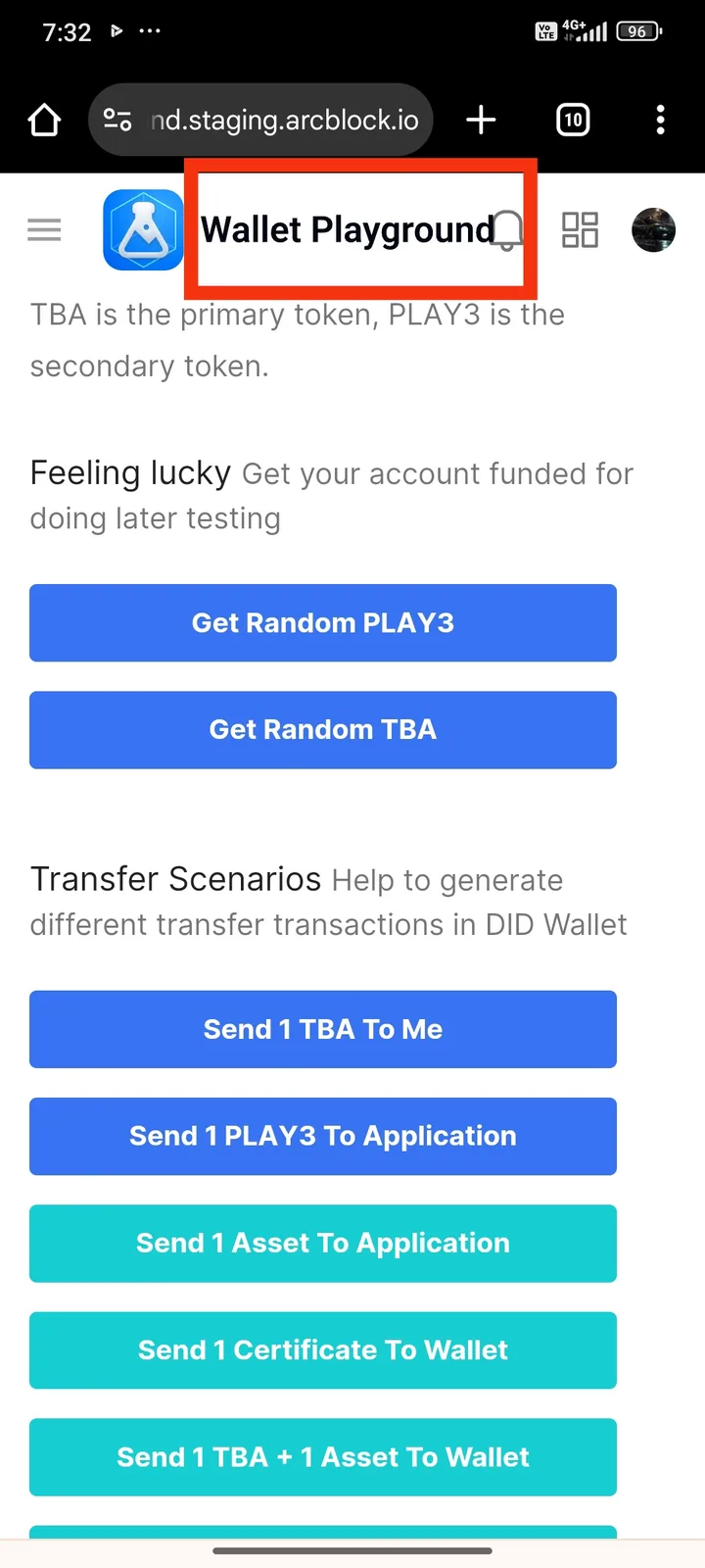
I was checking out the Wallet Playground page on my mobile device when I noticed a potential UI issue.
It looks like the "Wallet Playground" text is overlapping with the notification icon at the top. This makes the layout look a bit off, and the text becomes harder to read.
I’m not sure if this is intentional or not, but I thought I’d point it out since it affects readability on smaller screens.
Thanks for all your hard work!