
UI Overlap / Clipping on "Back To Use-Case" Tooltip

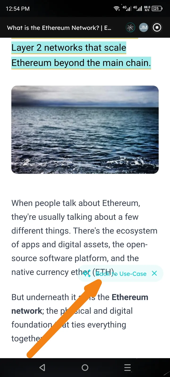
Description
The "Back To Use-Case" floating UI element is appearing with incorrect z-index or opacity settings relative to the text content, causing a visual overlap. Specifically, the text "(ETH)" and following punctuation are bleeding through or appearing on top of the button background, making the tooltip difficult to read and visually inconsistent.
Steps to Reproduce
- Open the Arcsphere.
- Navigate to a content page (e.g., "What is the Ethereum Network?").
- Trigger an action that surfaces the "Back To Use-Case" floating button (likely after highlighting or interacting with specific technical terms).
- Observe the positioning of the tooltip over the paragraph text.
Observed Result
The floating button has insufficient background opacity or a layer conflict, allowing the underlying webpage text ("ETH") to overlap the "Back To Use-Case" label.
Expected Result
The "Back To Use-Case" floating element should have a solid or sufficiently opaque background and a higher z-index than the webpage content to ensure it remains legible and visually distinct from the background text.
Suggested Fix: Increase the z-index of the tooltip container and ensure the background blur/fill is set to 100% opacity to prevent text bleed-through.