
"Search" Button Text Obscured by Overlapping Icon

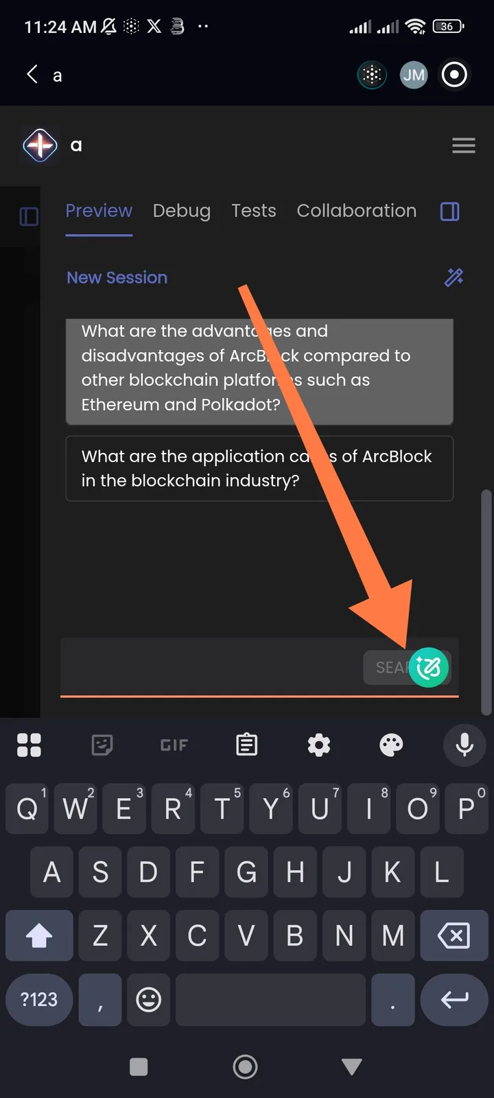
In the message or command input area, the text for the "Search" button (presumably located in the bottom-right corner of the input box) is visually merging with or being obscured by an adjacent circular icon (which has a stylized drawing/sparkle on it). The overlap makes the word "SEARCH" difficult to read and creates a visually cluttered and unprofessional appearance.
1 条回复
重复的问题 UI Element Overlap/Misplaced Sticker on "Import" Button