
Mobile Layout Displayed on Desktop

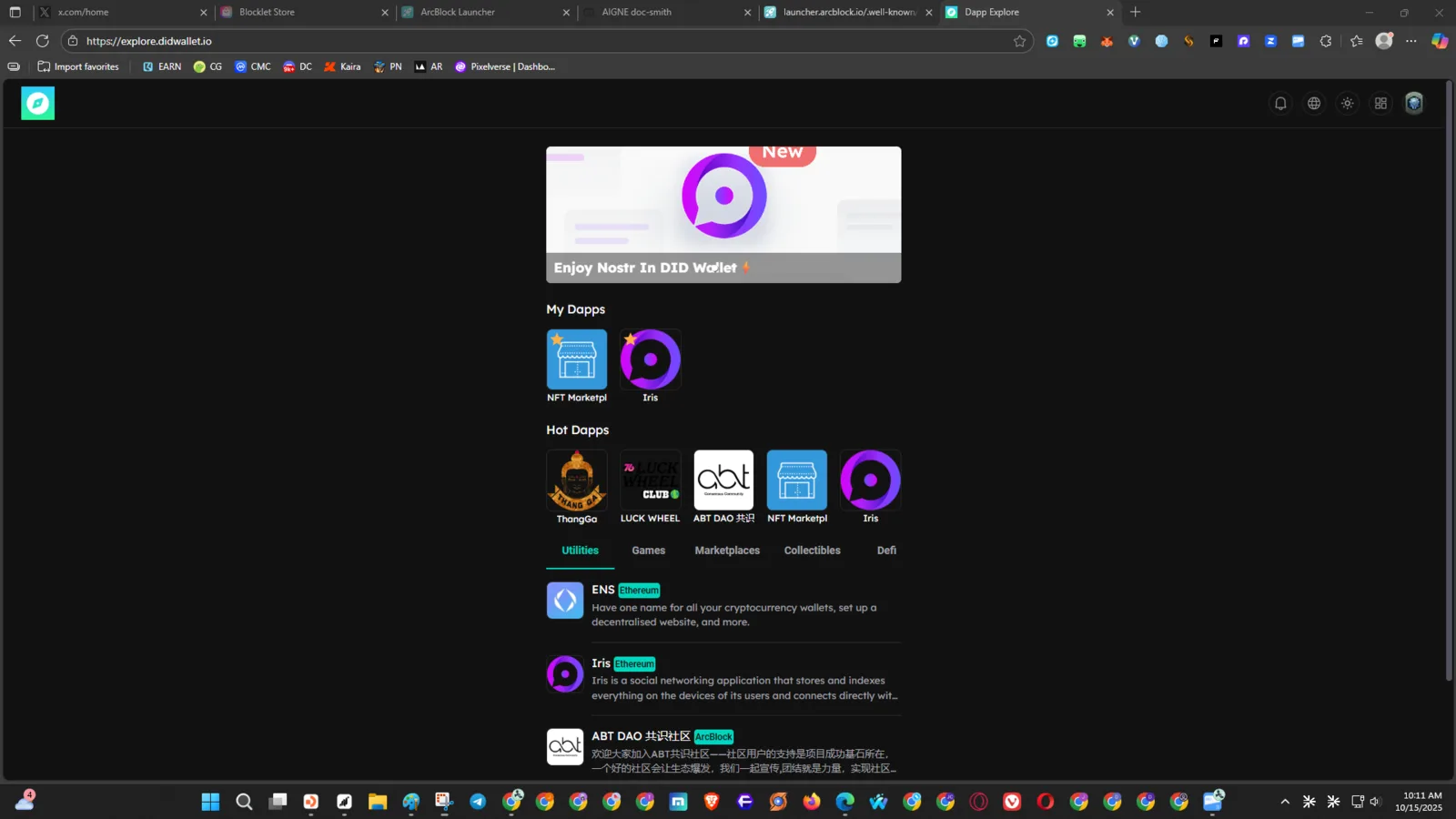
Product: DID Wallet Explorer URL: https://explore.didwallet.io/ Environment:
- Device: Desktop (Windows 11)
- Browser: Chrome (latest version)
- Screen Resolution: 1920×1080
- Theme: Dark
🧾 Description
When accessing https://explore.didwallet.io/ on a desktop browser, the site incorrectly displays the mobile/phone layout, instead of adapting to a desktop view. The content appears vertically compressed, with mobile-style navigation and scaling, making it hard to use on larger screens.
🔁 Steps to Reproduce
- Open a desktop browser (e.g., Chrome or Edge).
- Navigate to https://explore.didwallet.io/.
- Observe that the layout and UI are styled as if for a mobile device.
✅ Expected Behavior
- The website should detect desktop viewports and render a responsive desktop layout.
- Text and UI elements should expand to use available screen space.
❌ Actual Behavior
- The UI remains locked in a narrow, mobile-style layout.
- Buttons and icons appear oversized and vertically stacked.
- No responsive adjustment occurs when resizing the window.
📊 Impact
- Poor user experience on desktop devices.
- Difficult navigation and wasted screen space.
- Reduces accessibility for desktop-based users and developers.
🧩 Possible Cause
- Viewport meta tag forcing mobile scaling (
<meta name="viewport" content="width=device-width, initial-scale=1">). - Missing CSS media queries for desktop breakpoints.
🧰 Suggested Fix
- Implement responsive design using media queries for larger screen widths.
- Detect and apply proper layout rendering for
min-width: 1024px. - Verify responsive behavior across Chrome, Firefox, and Edge.