
Mobile Layout Breaks in Appearance Menu – Non-Responsive UI and Overlapping Elements

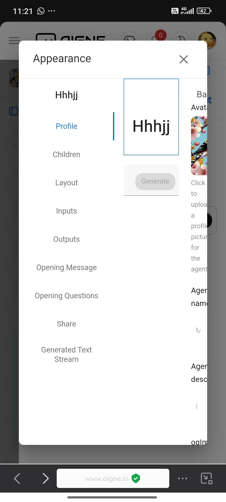
I noticed a layout issue when accessing the Appearance menu from a mobile device. The interface doesn’t appear responsive — the navigation tabs on the left (like Profile, Children, etc.) are crammed together without clear spacing, and the main content on the right is partially cut off. This made it difficult for me to interact with or even understand the available settings. It feels like a desktop layout is being forced into a small screen without proper adaptation, which really hurts the mobile user experience.
1 reply
你好,推荐在 PC 上使用 PagesKit 的编辑页面,这个编辑页面交互相对复杂,目前还没有适配移动端的计划。