
Text “Each DID corresponds to a Domain” Not Fitting Properly on Mobile Screen

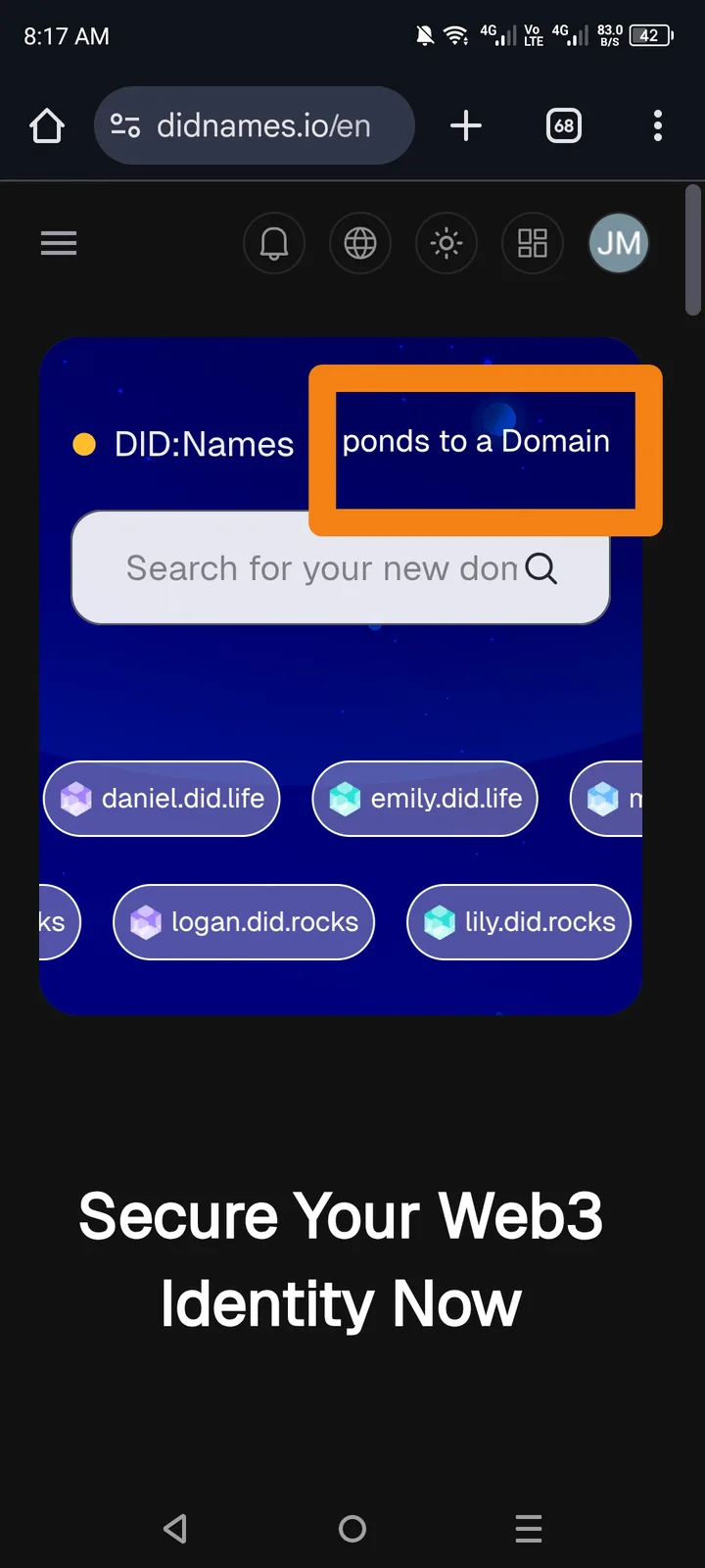
🌐 Website: https://www.didnames.io/en 📱 Platform: Mobile Browser (e.g., Chrome, Safari) 📂 Feature / Page: Homepage — Intro / Description Section 📅 Environment: Mobile View 🔗 Related: UI / Responsive Design
🧾 Summary: On mobile devices, the text “Each DID corresponds to a Domain” does not fit within the screen width. It appears either cut off, overflowing, or requires horizontal scrolling, which breaks the site’s mobile layout.
🧪 Steps to Reproduce:
- Visit https://www.didnames.io/en using a mobile phone.
- Scroll to the section containing the text: > “Each DID corresponds to a Domain” >
- Observe the layout and text fitting.
💥 Actual Result:
- The text overflows outside the visible screen area.
- It does not auto-wrap or scale to fit within the display.
✅ Expected Result:
- The text should automatically adjust or wrap properly within the screen size.
⚙️ Possible Cause:
- CSS issue in responsive design — fixed width or non-wrapping container.
- Missing
word-wrap,max-width, orviewportscaling settings for mobile.
🧱 Severity: 🟡 Minor (UI/Layout Issue) 🎯 Priority: Medium 📂 Category: UI / Responsive Design
💡 Suggested Fix:
- Apply CSS rules for responsive text wrapping:
javascript .did-text { word-wrap: break-word; white-space: normal; max-width: 100%; } - Use media queries for smaller screens to adjust font size and padding.
- Test on multiple devices (iPhone, Android, small tablets) to ensure consistency.