
Token Data and USD Logo Need Spacing in DID Wallet

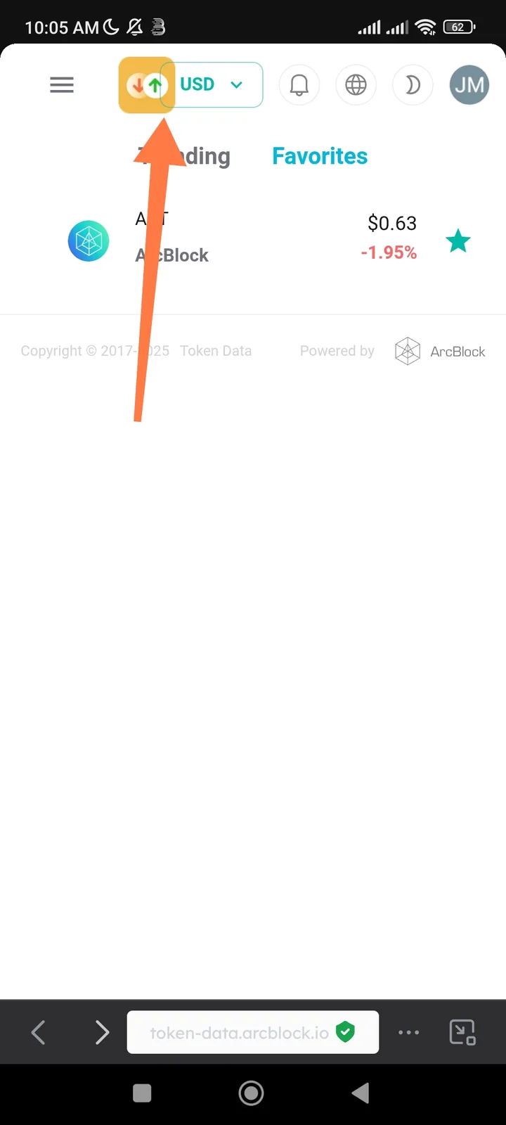
🧾 Summary: In the Token Data section of the DID Wallet app, the token logo and the USD symbol/value are displayed too close together, with no visual spacing. This makes the interface look cluttered and hard to read.
🧪 Steps to Reproduce:
- Open the DID Wallet app.
- Go to Token Data (where token balances and values are shown).
- Observe the placement of the Token logo and the USD label/value.
💥 Actual Result:
- The Token logo and USD text/value appear touching or overlapping with no space between them.
- Visually inconsistent with the rest of the UI.
✅ Expected Result:
- There should be clear spacing (padding or margin) between the token logo and USD label/value.
- Example: at least 4–8px of space for visual clarity and readability.
⚙️ Possible Cause:
- Missing margin or padding in the UI layout XML / CSS component.
- Fixed element alignment not responsive to font size or scaling.
🧱 Severity: 🟡 Minor (UI/Visual Issue) 🎯 Priority: Medium 📂 Category: UI / Visual Design
💡 Suggested Fix:
- Add horizontal margin or padding between logo and USD text.
javascript .token-logo { margin-right: 6px; } - Ensure responsive spacing across different screen resolutions.
- Verify consistent alignment in light and dark modes.
1 reply
duplicated with: 顶部控件重叠