Aistro unprofessional looking screenshot on official instructions

I feel like this could definitely be tidied up to look more professional, the rest of the app looks great but the red circles overlay on the screenshot look really out of place… I’ve highlighted these with the yellow circle and arrow, wouldn’t take much to do an updated screenshot featuring actual neat shapes highlighting the areas of interest rather than just red squiggles but would look a lot more in line with the rest of the app. 👍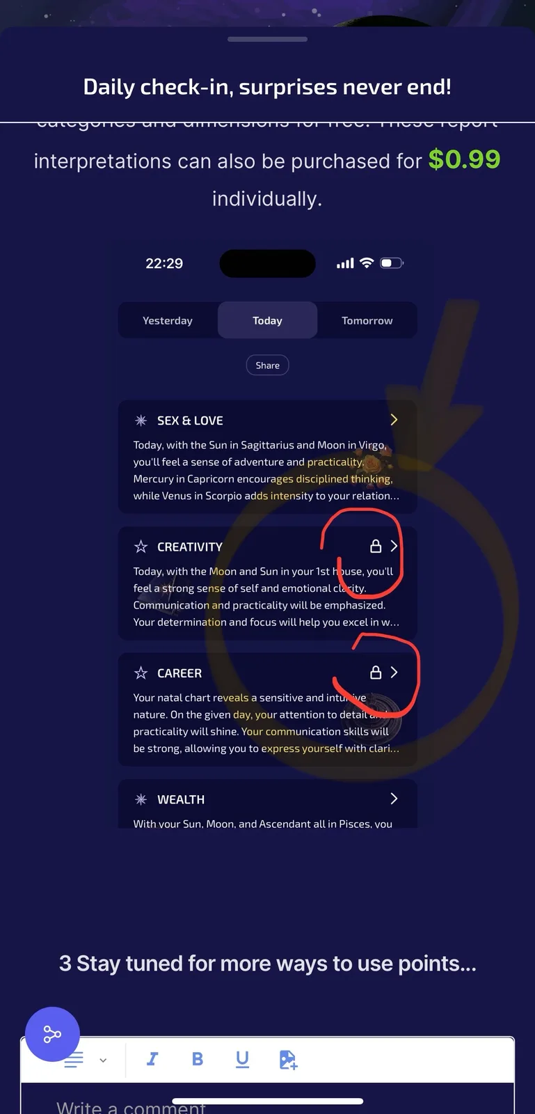
3 replies
heres a screenshot I tidied up if that helps you’re welcome to use it as a replacement 😊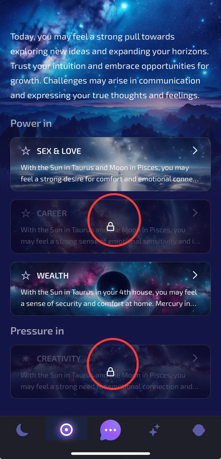
👀
Thank you very much for providing the new screenshots. The illustrations in the article have been updated with the images you provided.
Daily check-in, surprises never end!