
UI Misalignment on Comment Section Icons

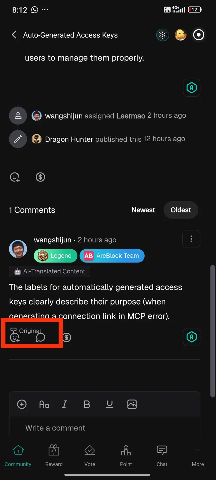
I noticed a display issue in the comment section. The icons next to the "Original" label appear misaligned and overlapping, making the interface look unpolished and potentially confusing for users.