Unusual Layout in ArcBlock Community Header

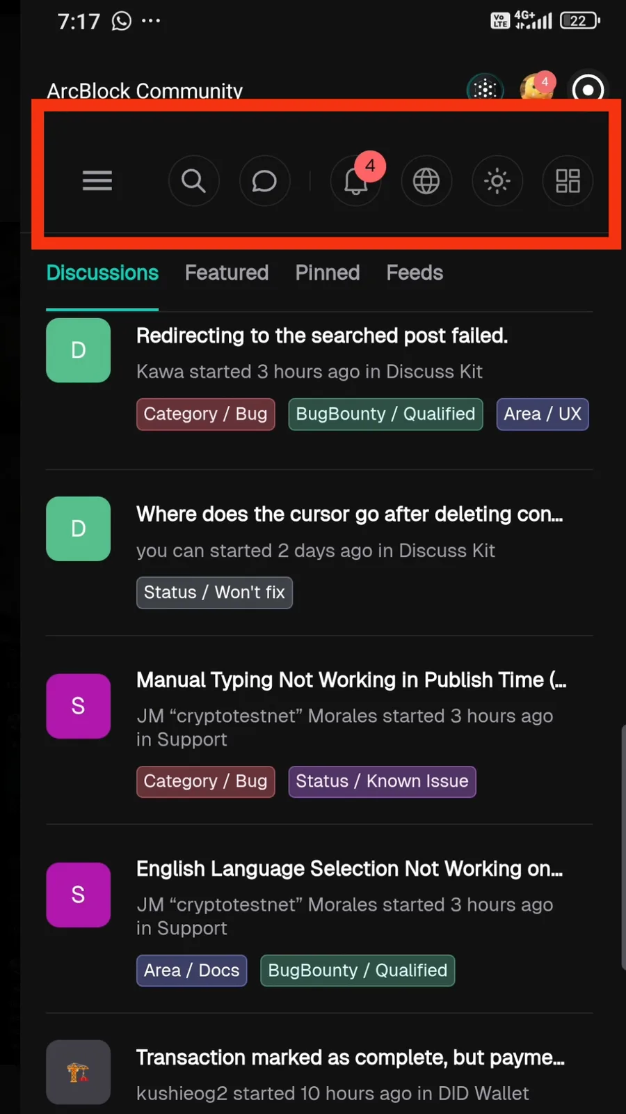
I noticed that the header section in ArcBlock Community looked a bit unusual compared to the normal design. The icons and layout seemed slightly off, but after refreshing the page the display returned to normal. I’m not sure if this was part of a new design update or just a temporary UI glitch, so I wanted to confirm with the team.